Today’s dashboard software is making it easier than ever to integrate and visualize data in a way that is as inspiring as it is applicable and valuable. While doing so is simple, an exceptional dashboard still requires strategic planning and designing.
Knowing your audience will help you to determine what data you need, and knowing what story you want to present tells you which data visualization type to use. Assuming you have clean data and the best data visualization software, your next step is to choose the right charts and graphs. This article suggests – what we think are – the most valuable data visualizations any analyst could use. Based on research, personal experience, and client reviews, these suggestions are a sure fire way to present your business data with flying colors.
Sunburst Graph
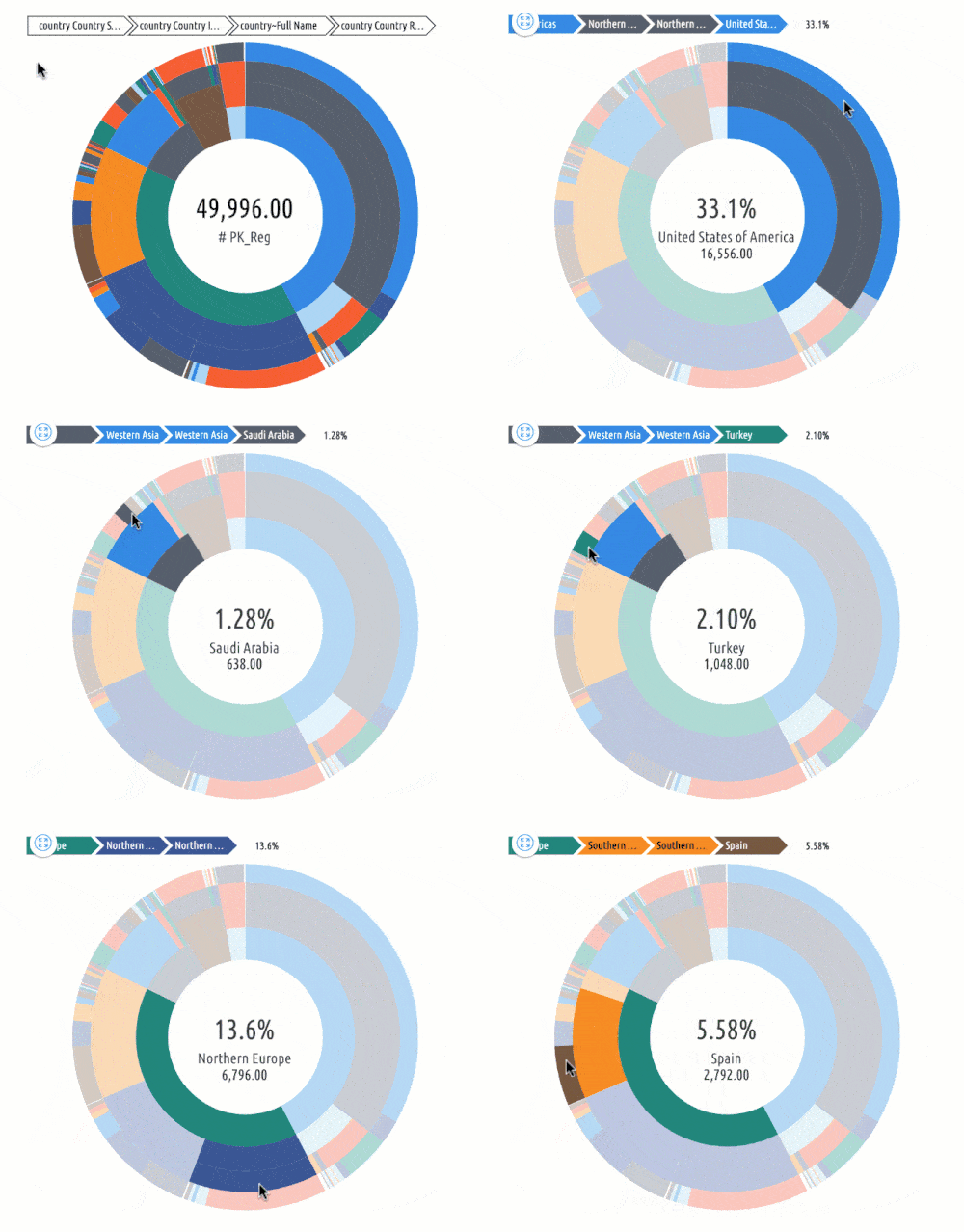
This interactive, radial space-filling visualization shows the aggregated values of subtrees. This is ideal for presenting hierarchical data (Ex. store locations and their sales by product/team member/date/etc.)
This visualization shows “hierarchy” through a series of rings that are divided into multiple categories. Each ring coincides to a level in the hierarchy. The innermost circle represents the root value and the hierarchy moving outwards from it.
The rings are sliced and divided based on their hierarchical relationship to the source slice. The angle of each slice is either divided equally under its source value or can be made proportional to a value.
Different colors are typically used to highlight hierarchical groupings or certain categories.
The value in this type of visualization is in the ability to see the root cause and effect of each piece of data, based on its parent’s value. You can answer questions about changes in your data that may or may not have been caused by another piece of data. Is one value controlling the other? Will a change in a parent value affect the child value?
Co-Occurrence Matrix
With a co-occurrence matrix, a network of data values can be represented by an adjacency matrix, where each cell ij represents an edge from vertex i to vertex j.
The effectiveness of a matrix diagram is heavily dependent on the order of rows and columns: if related nodes are placed close to each other, it is easier to identify valuable clusters and bridges.
This type of diagram can be extended with reordering of rows and columns, and expanding or collapsing of clusters, to allow deeper exploration of important relationships within your data and business.
While path-following is harder in a matrix view than in a node-link diagram, matrices have other advantages. As networks get large and highly connected, node-link diagrams often devolve into giant webs of line crossings. With matrix views, line crossings are impossible. Matrix cells can also be encoded to show additional data. Colors are often used to depict clusters calculated by a “community-detection” algorithm.
Co-occurrence matrix visualizations hold value in their accessibility of relationships among every piece of your data, and how “strong” that relationship is. Does one piece of data occur more often when another, separate piece of data is also occurring more often? Or vice versa? The effects of each piece of data on one another is quite endless, and valuable, if their relationship is fact a “strong relationship”.
Choropleth Map
The purpose of a choropleth map is to display geographical areas or regions that are colored, patterned, or shaded based on a specific data variable. This gives the user a way to visualize data values over a geographical area, showing variation or patterns across the available location. Choropleth maps give us the ability to represent a large amount of data over any amount of space in a concise and visually engaging manner.
The data value uses “color progression” to represent itself in each region of the map. This can be blending from one color to another, transparent to opaque, hue progression, light to dark, or an entire spectrum of colors.
There are 3 basic criteria necessary to use a choropleth map:
- The data is spatially related (i.e. countries, states, counties), or “enumeration units”
- Data is not raw; it has been processed to reveal rates/statistics/ratios
- The data could be collected and used anywhere in space
These criteria quickly reveals the fact that to effectively use a choropleth map, the purpose must be statistically related, and be able to freely cover any area in space.
For any business that produces data over a geographical area – sales, political, population, etc. – a choropleth map is your best visualization option to display growth/success/comparisons of that data over the respective area in an instant. Most choropleth maps are also interactive, giving you the ability to drill down into each geographical area’s data results by simply moving your mouse over that area.
The value a choropleth map provides is simple: instant comparable geographical data representation. Are your east coast sales doing better than your west coast sales? Is your political campaign more successful in one county than in another? The answers provided about your geographical data are endless.


